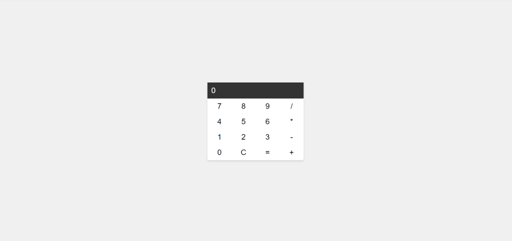
In the world of web development, creating a sleek and responsive calculator is a great way to practice your HTML, CSS, and JavaScript skills. Not only will it enhance your understanding of these technologies, but it will also result in a handy tool that you can use for everyday calculations. In this step-by-step guide, we’ll walk you through the process of building a good-looking and responsive calculator that can perform basic operations like addition, subtraction, multiplication, and division.
Setting up the HTML Structure
Let’s start by creating the basic HTML structure for our calculator. We’ll have a container for the calculator, a display for input and results, and buttons for numbers and operations.
HTML:
<!DOCTYPE html>
<html lang="en">
<head>
    <meta charset="UTF-8">
    <meta name="viewport" content="width=device-width, initial-scale=1.0">
    <link rel="stylesheet" href="style.css">
    <title>Responsive Calculator</title>
</head>
<body>
    <div class="calculator">
        <div class="display">
            <input type="text" id="result" value="0" readonly>
        </div>
        <div class="buttons">
            <!-- Buttons will be added here using JavaScript -->
        </div>
    </div>
    <script src="script.js"></script>
</body>
</html>
In this section, we’ve set up the basic HTML structure, including an input field for the display. The buttons for the calculator will be dynamically added using JavaScript.
Styling the Calculator with CSS
Now, let’s make our calculator visually appealing by adding some CSS styles. Create a style.css file and apply the following styles. We’ll make it responsive, so it looks great on both desktop and mobile devices.
CSS:
body {
    display: flex;
    justify-content: center;
    align-items: center;
    height: 100vh;
    margin: 0;
    background-color: #f0f0f0;
    font-family: Arial, sans-serif;
}

.calculator {
    background-color: #fff;
    box-shadow: 0 4px 6px rgba(0, 0, 0, 0.1);
    border-radius: 5px;
    width: 300px;
}

.display {
    background-color: #333;
    color: #fff;
    padding: 10px;
    text-align: right;
}

input {
    border: none;
    background: none;
    width: 100%;
    font-size: 24px;
    color: #fff;
}

.buttons {
    display: grid;
    grid-template-columns: repeat(4, 1fr);
}

button {
    border: none;
    background: none;
    font-size: 24px;
    padding: 10px;
    cursor: pointer;
}
These CSS styles provide a clean and modern appearance to our calculator, making it visually appealing.
Adding Functionality with JavaScript
Now, it’s time to add the JavaScript functionality to our calculator. Create a script.js file and include the following code.
JS:
// Select the display input field
const display = document.getElementById("result");

// Function to update the display
function updateDisplay(value) {
    display.value = value;
}

// Function to create buttons
function createButton(label) {
    const button = document.createElement("button");
    button.textContent = label;
    return button;
}

// Add event listeners to buttons
const buttonContainer = document.querySelector(".buttons");

const buttonLabels = [
    "7", "8", "9", "/",
    "4", "5", "6", "*",
    "1", "2", "3", "-",
    "0", "C", "=", "+"
];

buttonLabels.forEach(label => {
    const button = createButton(label);
    button.addEventListener("click", () => {
        if (label === "=") {
            try {
                updateDisplay(eval(display.value));
            } catch (error) {
                updateDisplay("Error");
            }
        } else if (label === "C") {
            updateDisplay("0");
        } else {
            if (display.value === "0") {
                updateDisplay(label);
            } else {
                updateDisplay(display.value + label);
            }
        }
    });

    buttonContainer.appendChild(button);
});
This JavaScript code adds functionality to our calculator. It allows users to input numbers and perform basic operations like addition, subtraction, multiplication, and division.
Making it Responsive
To make our calculator responsive, we can use media queries in our style.css file to adjust the layout for different screen sizes.
CSS:
/* Small screens (mobile) */
@media (max-width: 600px) {
    .calculator {
        width: 80%;
    }
}

/* Medium screens (tablets) */
@media (min-width: 601px) and (max-width: 1024px) {
    .calculator {
        width: 60%;
    }
}

/* Large screens (desktop) */
@media (min-width: 1025px) {
    .calculator {
        width: 400px;
    }
}
These media queries will adapt the calculator’s layout for small screens (mobile), medium screens (tablets), and large screens (desktop).
Conclusion
Congratulations! You’ve successfully built a responsive and good-looking calculator using HTML, CSS, and JavaScript. This project allows you to apply various JavaScript concepts like event handling, DOM manipulation, and conditional statements in a practical way. Whether you’re a beginner or an experienced developer, creating such projects is a great way to sharpen your coding skills and have a handy tool at your disposal.
Feel free to enhance your calculator by adding more features like percentage calculations or scientific functions. The possibilities are endless, and it’s a fantastic way to keep improving your web development skills. Happy coding!
Click here to get the complete source code.
Here is an article on how to host this app online using GitHub.

